smartButton
Buttons communicate the action that will occur when the user touches them.
Material buttons trigger an ink reaction on press. They may display text, imagery, or both. Flat buttons and raised buttons are the most commonly used types.
Additional button types include:
- Persistent footer buttons are flat buttons that may be used in screen footers or dialogs.
- Floating action buttons are circular buttons that represent the primary action in an application.
- Dropdown buttons display multiple selections.
- Toggle buttons group related options. Icon toggles allow a single choice to be selected or deselected.
Flat buttons
Flat buttons are text-only buttons.
They may be used in dialogs, toolbars, or inline.
They do not lift, but fill with color on press.
Raised buttons
Raised buttons are rectangular-shaped buttons.
They may be used inline.
They lift and display ink reactions on press.
Elevation
Flat buttons: 0dp
Raised buttons: 2dp

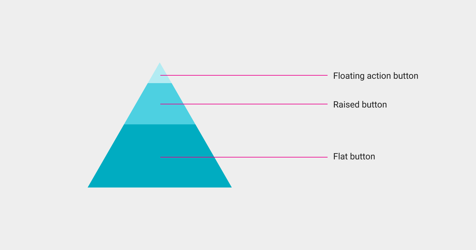
Button types
There are three standard types of buttons:
- Floating action button: A circular material button that lifts and displays an ink reaction on press.
- Raised button: A typically rectangular material button that lifts and displays ink reactions on press.
- Flat button: A button made of ink that displays ink reactions on press but does not lift
Floating action button
Raised button
Flat button
Example of a floating action button
Example of a raised button
Example of a flat button
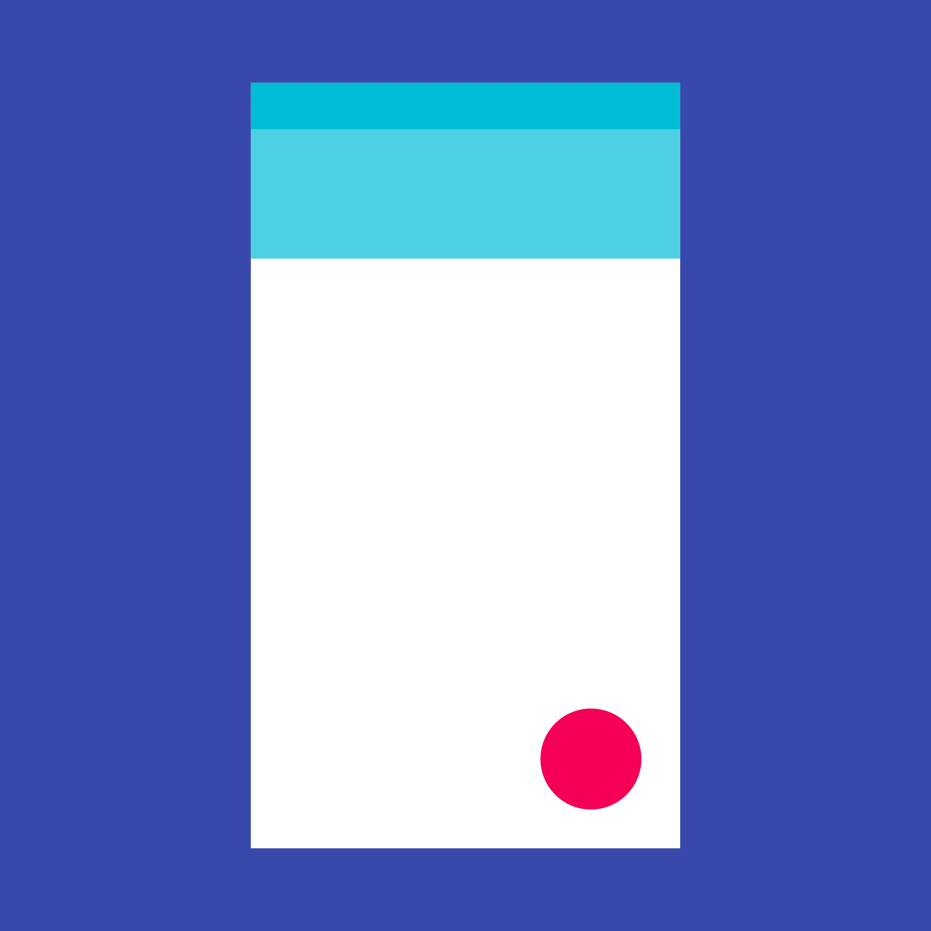
Floating action buttons
A floating action button represents the primary action in an application.
A floating action button is used for a promoted action.
Shaped like a circled icon floating above the UI, it changes color upon focus and lifts upon selection. When pressed, it may contain more related actions.
Usage
Only one floating action button is recommended per screen to represent the most common action.
Behavior
It animates onto the screen as an expanding piece of material, by default.
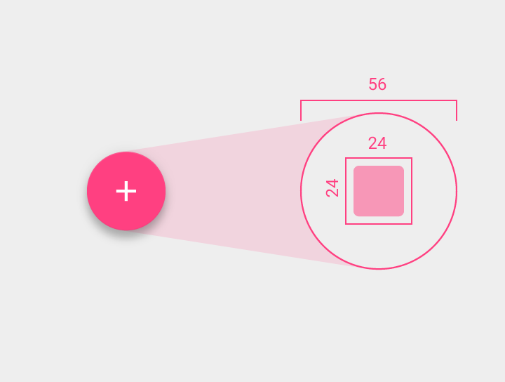
Sizes
Default: 56 x 56dp
Mini: 40 x 40dp
The floating action button should be placed 16dp minimum from the edge on mobile and 24dp minimum on tablet/desktop.
Raised buttons behave like a piece of material resting on another sheet – they lift and fill with color on press.

Raised buttons behave like a piece of material resting on another sheet – they lift and fill with color on press.
smartCheckBox
Checkboxes allow the user to select multiple options from a set.
If you have multiple options appearing in a list, you can preserve space by using checkboxes instead of on/off switches.
If you have a single option, avoid using a checkbox and use an on/off switch instead.
Light theme for check boxes
Dark theme for check box
Light
On: #009788, Opacity 100%
Off: #555, Opacity 100%
Disabled: #000000, Opacity 25%
|
hover |
focused |
pressed |
disabled |
|
|
On |
|
|
|
|
|
Off |
|
|
|
|
Light theme for check box in hover, focused, pressed, disabled states.
Dark
On: #009788, Opacity 100%
Off: #1978CC, Opacity 100%
Disabled: #FFFFFF, Opacity 25%
|
hover |
focused |
pressed |
disabled |
|
|
On |
|
|
|
|
|
Off |
|
|
|
|
Dark theme for check box in hover, focused, pressed, disabled states.